


Lessons worth sharing from the HfP redesign process
Links on Head for Points may support the site by paying a commission. See here for all partner links.
When we relaunched Head for Points a couple of weeks ago, I said that I would do a piece on how we approached the project. I had a few emails from readers chasing it up, so here we go. This is really a ‘thank you’ article dressed up as a ‘how to’ piece.
There is absolutely nothing about travel, miles or points in this article – be warned!
What software powers a site like HfP?
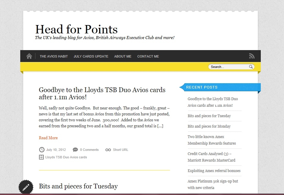
This site, and almost all others like it, is built on a piece of free software called WordPress. Think of a WordPress ‘theme’ as the equivalent of a PowerPoint template. A Google search for WordPress themes will bring up hundreds of ‘off the shelf’ designs you can buy, but our requirements have become complex and we needed to commission something bespoke.
The old HfP was built on a non-responsive off-the-shelf theme written about 13 years ago, which is a lifetime in tech. I think I paid $50 for a licence and then £250 or so to someone to adjust it to our requirements.
‘Non-responsive’ means that the layout did not change depending on screen width or device. This had some advantages – we could always line things up nicely because the text never moved around – but many downsides. As screens got bigger and higher res, HfP would often look marooned in the middle with huge amounts of blue space down the sides! For mobile, we had to run a totally separate theme which was extra work.
Good design cannot make up for bad content
Let’s be clear about one thing. Good design does not, in itself, make a successful website. There are MANY sites which look substantially better than HfP but are less successful. HfP has prospered because people seem to like the content and didn’t care about (or were prepared to ignore) the look.
You need to face reality though. We clearly lost some potential readers because they never got far enough to realise how suitable the content was. I know for certain, because Sinead is in the front line, that we were losing commercial revenue.
About three years ago I made an aborted attempt to update HfP. I commissioned a layout from someone I knew, on a low budget, based on my own design ideas. The end result didn’t work as I wanted it to, mainly because I was taking ideas from 3-4 year old sites. The new look felt dated before it launched, and so it never was launched.
When Rhys joined full-time last year, he pushed me to look again at a redesign. He offered to run the project, and it turns out he has secret tech skills which we never knew about!

Nine months ago ….
Unbelievably, we started the project back in November. We did what we thought you were meant to do – used Google to find design agencies who specialised in WordPress (the software which runs HfP) and then drew up a random shortlist based on how much we liked the look of their websites.
Pre corona, we wanted a London-based agency so we could be hands on. This was always going to add to the cost but was a trade-off we were happy with.
Rhys, Sinead and myself went on a tour of design agencies after Christmas. In general, we were not happy. We had supplied a brief of our requirements but few seemed to have read it or fully understood what we wanted.
(What we wanted was a simple, ‘clean’ site which was clearly derived from the original, but also clearly modern. ‘Simple’ is not easy. Apple aside, few companies can crack it. Why are TV remote controls so awful, for example?)
The agencies we met had expensive offices in expensive parts of London with lots of receptionists and other support staff. It was clear who would end up paying for all this. One told us that eight people, at a minimum, would be assigned to our project at all times. (Hint: that’s at least six too many.)
The quotes, when they arrived, were +/- £40,000 + VAT for design and IT development. We might have gone for it if any agency had blown us away, but none did.
We needed a Plan B.
We turned to the most stylish man I know ….
In the search for a modern, clean site, I went to the most stylish man I know – Simon Crompton, who runs the Permanent Style website. If you like tailoring, you should be reading it. We don’t know each other well but I enjoy his site and we’d met a few times over the years.
Simon pointed me to Birch London, run by James Allen.
Birch is a small practice (no receptionists!) with a modest office in Borough. The small team and owner-led approach was a natural fit for us.
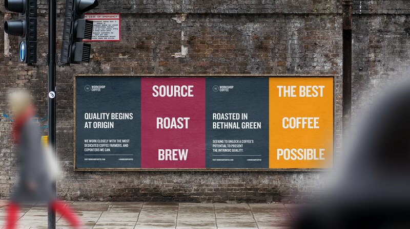
Birch London works for people like the St John restaurant (they did the St John website), Conde Nast Traveller, Ettinger, Glenmorangie and the like. They also have a niche in designing branding and packaging for expensive ground coffee companies! These are, in general, design projects driven by typography.
The words on HfP have always been more important than the images, and we felt they understood that. We knew we had to have bigger pictures, but not at the expense of what we wanted to say.
It also helped that the price Birch quoted was a lot less than £40,000 ….
Welcome Zoom ….
It was now March. We had just received the contract when lockdown struck. The upside was that we had a lot of time on our hands to focus on the project. The downside was that we were going to do it all via Zoom, which was the one thing I had wanted to avoid.
My plan was to do the logo last. Birch insisted we do it first, and that the rest would then flow naturally. I was personally unsure but we ran with it. They delivered four initial designs, and we took one unanimously. We liked the subtle way that aircraft imagery was worked in.
(There is actually a second variant of the logo which Rhys originally fought for and I resisted. We agreed to settle it on the day before launch. In the end, I softened towards his choice but he had also softened towards mine, so we kept the one which was on the dummy site.)
We then got into a cycle. The site was broken down into chunks – home page, article page, the hotel promos page, the credit cards page etc.
Rhys, Sinead, Anika and myself would brainstorm ideas for each chunk and put together a document of examples we liked or disliked. We would then have a long Zoom call where we would bounce these ideas around with Birch. James, the founder of Birch, was on 90% of the design calls which was important.
As we used to joke, Birch would essentially ditch most of our suggestions – whilst understanding the underlying points we wanted to make – and come back with something better.
The day I knew it would work was when we got the first draft of the home page, which hasn’t changed much between the first cut and the final version. I breathed a sigh of relief, because I knew then that it would be OK in the end.
The original designs are not coded – they are mocked up using standard design software. However, there are tools (apparently) which do much of the donkey work in terms of converting the design into WordPress code. This meant that the IT stage was quicker and cheaper than I expected. Once it got into coding, I stepped back and let Rhys manage the project, because he actually understood what was going on.
The launch
Nine months from when we emailed out our first enquiries to potential design teams, we finally launched. The launch, oddly, was a bit of an anti climax, because by then we’d lived and breathed the new site for so long.
In the three weeks since the launch, we’ve been working hard to squish bugs and tweak things. It is an on-going process and we are not yet fully there so bear with us.
Some things you have requested are in hand, such as a revamp of the way comments are laid out and the ability to re-order comments ‘date first’. The ‘Recent Comments’ list may also reappear. There will be no ‘big bang’ change – new features will just appear as we work down the list.
All in all, we are happy. The feedback from the people who pay the bills – our advertisers and commercial partners – has also been very positive. Our hope is that incremental ad revenue will quickly cover the costs of the project.
Thank you to ….
At the end of all this, I really need to thank:
Sinead, Anika and Rhys for all their contributions to the design process, and especially to Rhys for managing the final few weeks
James Allen and Jack Pearson at Birch London, plus their IT contractors, who did everything they promised and only overshot the original quote by 4%!
Simon Crompton of Permanent Style for the original introduction
Neil Barrett at Enbecom, our long-term IT partner
Lessons learned
If I have to say what I have learned from all this, it would be:
Look for a partner with a similar ethos, size and style to your own company. If you’re an ‘owner managed’ business like HfP, find partners who operate in the same way.
Don’t get too hung up over what sort of work your agency does. We ended up using an agency which was more of a brand developer than a website design agency. It didn’t matter. In fact, I think their broader view of branding and design helped.
Treat the cost of the project as money that you will earn back through additional commercial revenue. This makes it less worrying.
Expect the designers to respect your underlying beliefs about what you want but don’t expect them to slavishly follow your ideas (and why are you paying them anyway?). Do make your red lines very clear – for example we insisted on keeping the chronological home page – so they can work around it. A committed designer will, if they really believe you are wrong, produce a Plan B anyway so you can see what you may be missing.
Don’t expect hundreds of design options. You’ll receive a handful of variants at best, but hopefully all are on the right track.
Accept the fact that a functioning, clickable, site is never going to be exactly how the original design looked, and that a lot of issues will emerge during the coding stage.
In a couple of weeks we’ll do a final article on the redesign where we will explain what we have changed in response to your initial feedback.
 Chris Heyes
  AndyGWP
  AJA
AJA  John
John  Genghis
  Pid
Pid  TGLoyalty
  Secret Squirrel
  marcw
marcw  joe flight
  ChrisC
  Alan
Alan  Alex Sm
  Alex
Alex  Declan Yates
  Flightsy
  Matt
Matt  Peter K
  Doug
Doug  Dubious
  Sapiens
  the_real_a


Comments (136)